Material design and flat design are the two most popular design styles currently in practice. Each approach has strengths and weaknesses. We thought about looking at both designs - but make no mistake, these are not mobile-only trends. Both flat and material designs can be employed on any modern website for desktop or mobile users--and we can all learn from each other.
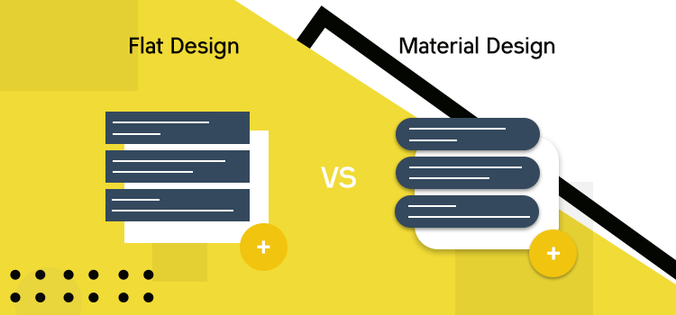
Flat design is known to be minimalistic, whereas Material design has a more 3D touch to it. If you are still in doubt about which one to pick up for your next design project, read on.
Flat Design
Flat design voices a simple slogan: “simplicity inspires creativity”.
In design lexicon flat design means there is less contrast, thinner lines and gradients. Everything looks solid and as if it's on the same surface. It’s a design that doesn't try to give a feeling of depth or perspective on focus items, which produces a minimalist appearance.
The term was first coined to describe the design of Google's operating systems and since then has become linked with mobile app design as well as web design.
Flat designs were first created as a huge improvement over skeuomorphic design (think fake leather, image overlays, etc.) but over time as a lot of designers started to create the most basic of flat designs, it began to look more like flat or basic.
As this trend grew and more designers began taking advantage of it, we saw almost every site using flat design. It has become “the” way to do things in web design. With all this momentum behind it, many people feel strongly that flat is better than everything else.
Flat designs do not have any 3D effects and are essentially 2D. These designs may also be called minimalist or modern because they aim to capture the essence of simplicity.
The flat design trend started to enter the design industry around 2007 and it became the norm in 2010. It had some impact on the graphic design before starting to impact other areas of the industry. Flat design was a major landmark in style and creation after skeuomorphic design (a term commonly used for Apple’s Human Interface Guidelines).
Skeuomorphism was all the rage a while back when brands were trying to make themselves look like they should be in a magazine. The flat design emerged as a reaction to this, and was all about “less is more” and keeping things simple.
Although over time, it’s been associated with terms like "minimalism" and "simplicity." But flat design isn't just about reducing elements to a minimalist style. It's also the trend to get rid of skeuomorphism in favor of abstract graphic elements.
How To Achieve Flat Design
Flat design is achieved using simple, clean lines and shapes.
It’s all about choosing a clean and minimalistic design, so you can use it for any purpose.
The Flat design theme minimizes elements to focus on functionality. Use flat, material typography to establish hierarchy, surface important actions and reveal important information at a glance. A good example of this method can be seen with the Google search homepage.
The color green is used to catch viewers' attention at first glance along with a familiar Google logo, but below those elements, one can quickly find and click on the text " Search your computer or the web. " This example helps viewers find what they are looking for efficiently, promoting simplicity for users and helping them become familiar with the page design.
Flat design is a simple and stylish way to view your favorite digital content. With no distracting borders, it does away with visual barriers by blending into the background. The result is a more natural and more comfortable user experience. Flat design makes use of different visual elements such as typography, icon, image etc. and its supporting components thereby creating a dynamic and functional environment.
Benefits Of Flat Design
The flat design includes more effective and beautiful expression, clarity of information hierarchy, and usability.
Flat design has many convincing advantages.
It is based on minimalism, so the UI can be simpler, cleaner and more functional than those with heavy ornamentation. In a flat design, there is large, well-organized, ample spacing, making a solid overall impression.
This visual style has seen a remarkable advancement in recent years, evolving from simple web graphics to immersive user experiences on mobile devices. An interesting feature of flat design is how much it differs from its predecessor, skeuomorphism. Flat design is more than just “flat” visuals; it is an entirely new mode of creation that empowers users and designers alike.
The flat design allows for better viewer engagement because it is more naturalistic and familiar to the eye. Designers now have access to different tools and resources to achieve better results with flat design.
Flat design can be used for a variety of purposes including digital elements like websites, advertising/marketing campaigns, and user interfaces. It has become popular for business and graphic design.
With the help of frameworks like Google Material Design, Materialize or Bootstrap, you can achieve a flat design in no time.
Disadvantages Of Flat Design
The smooth, clean appearance of the interface is clear and simple, and it allows the app’s main functionality to shine through. However, what if you don’t like it?
Technology moves fast and smaller start-ups find themselves having to compete with established companies who have much larger marketing budgets.
There are plenty of reasons why a startup might want to avoid flat design. Pricing is a good one. Generally speaking, flat design tends to be cheaper than other options, such as material design, but not always.
Leaders in some product categories are starting to break from this trend by bringing back some of the design appeal that was lost and that makes a difference.
Designers miss the days when they could add depth and layers to their designs without having to worry about whether the look would scale across a wide range of devices.
Flat design is not suitable for all types of products. It fails to consider the psychological effect it has on users. The quality of flat design may be low. Difficulties include a lack of depth, mystery and excitement which tend to result from flat design.
Lack of utilization of color and a repetitive look can make the product less attractive
Flat design is a very popular trend for websites, mobile apps and UI projects now but that doesn't mean that flat design will last long. In fact, we have already seen the trend reversing in 2017.
Materials Design
Material design is a design philosophy introduced by Google. It was first introduced with Android 5.0, also known as Lollipop, but has since trickled down application-wise to all platforms.
Google launched its new design philosophy called Material Design in June 2014. More recently, at Google I/O Conference 2015, the company gave more details about the philosophy and announced that it would be a part of all Google’s apps going forward.
The introduction of material design also meant the evolution and standardization of flat design as well.
Material design is a new way of designing user interfaces that combines the classic principles of successful user interface design with the innovation and possibility of technology and science.
Google has promoted material design as an interaction model for use across all platforms, including the web. Overall this is great news for designers as it provides them with clear guidelines on how the different elements should be organized, what each component means and more importantly how they should work together to provide an exceptional user experience.
A colossal question that confronts a designer regardless of his work is, how to make things look cool. The designers have taken themselves into another extreme – a trend towards material design.
The idea behind the material design is to create a design system that allows digital components to feel like the physical world, with shadows and real-life phenomena – simple motion, in particular, has been a huge focus during the creation of the material design.
Inspired by the success of the flat design, material design is a step-up from flat design. The idea of Material Design is to approach cross-platform and responsive design with an understanding that it is mobile-first.
The material design combines depth, movement, physics, and enhanced touch interactions to create a holistic experience. The material design makes your app delightful.
Material design is used for designing Android applications, web applications, and even elements of websites like buttons and icons, to increase usability and foster consistency with their applications.
It is truly an interesting design trend. On one hand, it focuses on usability and aesthetics over brand identity. On the other hand, it takes a lot of cues from modern brand identity trends.
Material design is simple, bold and makes you feel more connected to your device.
Advantages Of Material Design
For starters, material design is aligned with the latest Google operating system. Designers all over the world are using it to create apps for Android phones, tablets, watches, televisions and even refrigerators!
Its layout and UI components give us several advantages to develop apps that are aesthetically pleasing and interactive. As such, it enables us to appeal to the senses of the users as well as our imagination. Furthermore, material design is extensively used in the mobile ecosystem including iOS, Android, Windows and Chrome OS. It has changed the way interfaces are designed and presented.
Material design was developed at Google to address certain problems within the Android operating system itself. Since then, it has grown popular amongst Android developers and customers alike.
Material design has become a new trend in app designing. This design can give your apps a lateralized, beautiful look and feel. It is easy to learn and lets you integrate animation with coding and combine it with any other design style.
The idea is to give a 3D look to the 2D designs of Android apps. Over some time, it has been adopted by many companies, organizations and developers.
The biggest advantage of material design is that it defines a common language between all Android apps. Material design will make Android more consistent and easy to digest for regular users. All visuals in material design should follow the same hierarchy of elements.
Problems With Material Design
There are some things that concern old school designers.
It is a complete visual language that doesn't give you much freedom to interpret it in your own way.
Also, as of now, the material design guidelines are not finalized so there's no official resource out there for people to refer to, while most apps still have consistent issues with different brands following their own interpretation of it.
The material design makes use of lots of animations which are fun but can also be a hindrance. Animations are beautiful, but they can slow down the user experience especially on mobile devices.
Material Design is an attempt by Google to unify the visual style of all products (web and mobile) under a consistent design language. The design is only valid for android devices.
This is one of the biggest disadvantages that you might face when using material design. Material design is an excellent concept, but Android developers are still struggling with it. A lot of apps and websites are designed in a very good manner, but they seem to be specially made for Android devices.
The material design does not bode well for the branding of mobile applications. As a result, many software developers have become disappointed since they are left with very little space for placing their corporate values and logos inside applications.
In the past; companies have used certain design elements to portray their company’s brand identity. These design elements could include a color scheme, typography, logo, or pattern. Material design uses minimalistic-looking components instead of common design elements. If you want your brand’s presence to be felt on a particular website, material design might not be the right choice for you.
Material design takes away the strong branding that’s used on most websites through color scheme and other design elements. Using this design philosophy, one of the big disadvantages is that the website becomes less recognizable as the brand itself. This may confuse users about what brand they are visiting and if they know the brand. This can lead to a less successful website if the users don’t recognize it as they go through the site.
Bottom Line
Material design was introduced by Google in 2014 and it has been getting more attention as more websites adopt it. But what exactly is material design? It is a mix of flat and skeuomorphic design.
It is supposed to make websites look more like real-world objects. Material design uses some 3D animation and effects quite prominently, while flat design uses natural materials like paper, cardboards etc. with minimal shadows.
Flat design is what Material Design takes the dominant parts from.
By now you have surely figured out that building a website using the material design is going to be the hottest thing since AI and ML.
Need assistance or have something to share? Connect with us! Reach us for any questions or comments.
